The choice of colors in a restaurant plays a key role in shaping how guests perceive the space and how they feel while dining. Specific shades can affect mood, influence whether a person feels comfortable, and even change how long they choose to stay. When restaurant owners and designers take time to understand color psychology, they can use visual choices to support the brand image and meet guest preferences. With a balanced and thoughtful palette, the interior becomes more inviting, promotes comfort and interaction, and leaves guests with a positive overall impression.
Warm colors — red, orange, and yellow — are often used in restaurants because they tend to increase appetite and spark more active conversations. Orange can make a place feel energetic and friendly. Yellow usually brings a cheerful and bright atmosphere. These shades are a good fit for places that want to feel dynamic and inviting. Still, too many bold colors might overwhelm the senses, so it’s important to keep things balanced.
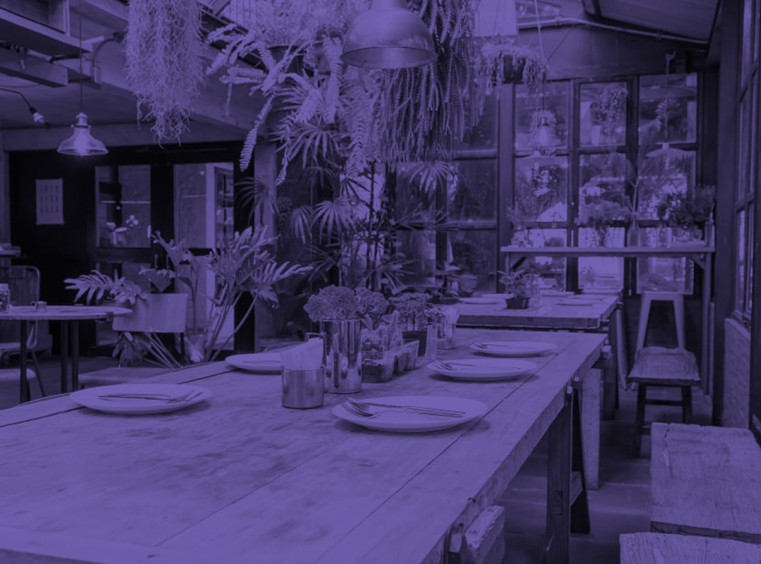
Cool colors such as blue, green, and purple have a very different effect. They help create a calmer, more relaxed mood, which works well in upscale or health-focused restaurants. Blue is often seen as fresh and clean, making it popular in seafood venues. Green reminds people of nature and health, helping set a peaceful tone—especially in places that focus on eco-friendly values. Purple is linked with elegance and premium style. These tones can also slow the pace of eating, letting guests enjoy their meal more mindfully.
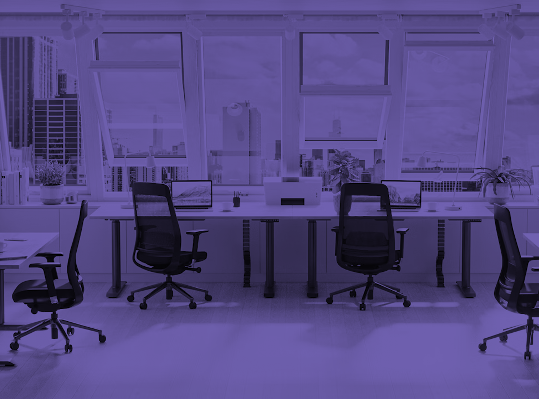
Neutral colors — like white, gray, and beige — are useful for creating a simple and clean look. They often serve as a background that lets other design parts shine. White gives off a minimalist, modern vibe. Beige and gray feel soft and pleasant, without distracting from the rest of the interior. These neutral tones also work well when paired with brighter details to add contrast and catch the eye.
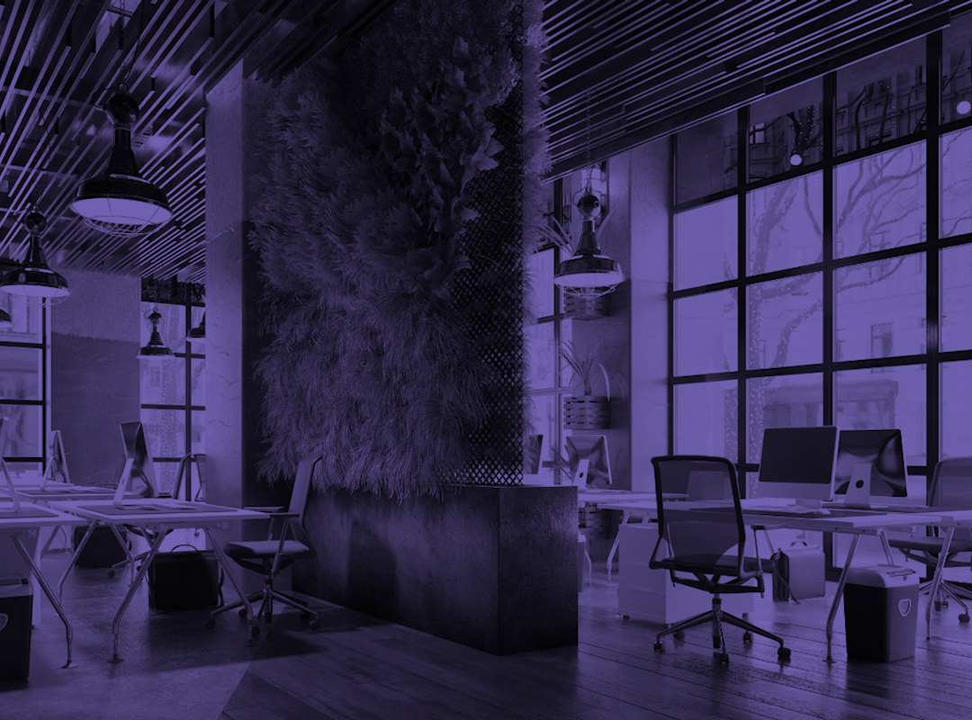
Colors don’t just affect mood—they also shape how space is experienced. Lighter shades can help a small room feel bigger, giving the illusion of more space. Darker colors do the opposite, making areas feel more closed-in and private. Adding bright tones brings energy into the environment, while more toned-down hues make it easier for guests to relax. When used correctly, color can help divide the restaurant into areas with different functions—some for quiet meals, others for more social activity.
Designers must also pay attention to how people from different cultures see colors. In some cultures, certain shades carry strong meanings, so using them without care can lead to the wrong impression. That’s why it’s important to study the preferences of your audience before choosing a final palette. A good match helps the space feel welcoming and respectful.
Transparent packaging and design elements can enhance the perception of honesty and freshness. Clear glass or acrylic display cases suggest transparency in food preparation, attracting health-conscious customers. This approach meets the growing demand for authenticity and safety in the dining experience.
Color psychology in restaurants covers far more than just the visual appearance of furniture or walls — it extends to every visual detail, from ambient lighting and the choice of plates to the uniforms worn by the staff. When these elements share a consistent color strategy, they work together to strengthen the restaurant’s visual identity and leave a cohesive impression on guests. Additionally, accent colors can be strategically placed to spotlight key areas, like featured seating zones or the beverage counter, subtly guiding customer flow.
Incorporating psychological color principles into restaurant interiors allows designers to create emotionally aligned environments. Selecting tones that match the restaurant’s character can shape how guests feel, where they choose to sit, and even how they engage with the space. A well-executed palette doesn’t just look good—it speaks to customers on a subconscious level, making the atmosphere more inviting and the visit more memorable.